Showing posts with label Leading Economic Indicators. Show all posts

Friday, April 17, 2020

Stocks Soar On Nothing But Hope

These two stories were the major ones today. Just the hope of a cure for the COVID-19 coronavirus sent the Dow to a close up more than 700 points, despite that the manufacturer of the hoped-for cure, Gilead, indicated that data is not yet sufficient to expect a cure.

Meanwhile, the market ignored economic bad news today that is the worst since World War II:

Sunday, January 15, 2012

Bill Hester: Five Risks to the Global Economy in 2012

As we're all a bit forecast weary by this point in the year, here's a list - not of prognostications - but rather of potential risks that may come into even greater focus this year. These risks – whether they intensify or pass – will likely play an important role in driving the performance of global stock markets in 2012.
1) The Persistence of Wide Spreads Among European Debt – Even if Bond Holders are ‘Rescued'
There are two components of the European credit crisis - debt levels and economic growth prospects. While the conversations to this point have leaned mostly toward reducing debt levels, economic growth prospects and the overall viability of a common currency will likely get a closer look this year, especially as Europe heads for recession.
During this two-year crisis investors have continually called on the ECB and euro area leaders to ‘fix' the debt issue: by wiping out half of Greece's debt, by protecting Italy's access to debt markets through bond purchases, or by suggesting a levered EFSF, the euro area's rescue vehicle.
But even if the ECB does bend to the will of the bond markets this year, and begins to buy sovereign debt directly, the single currency is left with all of the same weaknesses that existed prior to the crisis: the inability to tailor interest rate policy for each individual economy, the lack of foreign currency adjustment needed to offset differences in competitiveness, and growth-limiting trade dynamics throughout the area.
Martin Feldstein, a long-time euro skeptic, in this month's Foreign Affairs magazine made the point this way: “During the past year, Germany had a trade surplus of nearly $200 billion, whereas the other members of the eurozone had trade deficits totaling $200 billion. A more comprehensive measure that factors in net investment income reveals that Germany has a current account surplus of nearly five percent of GDP, whereas Greece has a current account deficit of nearly ten percent of GDP. Put another way, Germany can invest in the rest of the world an amount equal to five percent of its GDP, whereas Greece must borrow an amount equal to nearly ten percent of its GDP to pay for its current level of imports”.
One of the strongest benefits at the introduction of the common currency was that investors priced government debt similarly across the euro area. During this period investors thought of the euro area as a group of countries that would not only share a currency, but also share economic performance and long-term outcomes. Smaller countries and those of southern Europe experienced the greatest amount of benefit from converging yields. Yield on Greek debt fell by more than half in less than 10 years. Even stock market valuation ratios converged. The spread between the countries with the highest and lowest PE ratios dropped by more than half during the period.
While this period could have been used to improve some of the issues surrounding productivity, competitiveness, and trade dynamics among countries, what occurred instead was that governments took on larger amounts of liabilities, and as interest rates fell, housing bubbles formed. With that period passed, it's difficult to imagine that investors will soon return to the mindset that Portugal, Ireland, or even Italy, will soon again converge materially – in either economic performance or level of credit risk - with Germany.
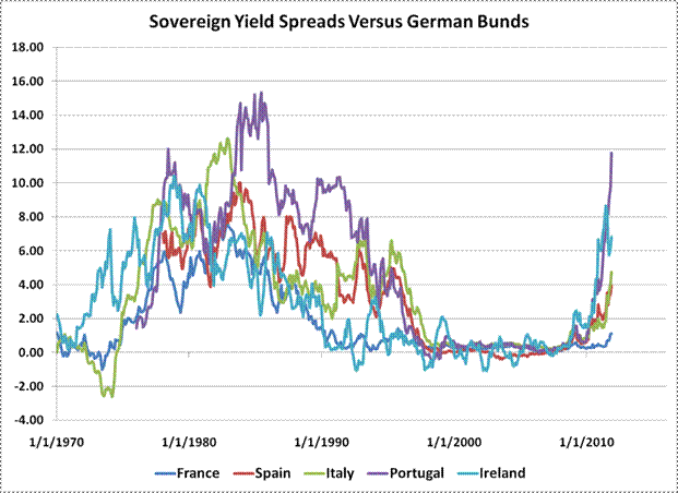
I highlighted this risk and the graph below early in the European credit crisis ( The Great Divergence ). At that point the sovereign debt of Portugal was priced at 200 basis points above German bunds, compared with 1100 basis points today. Here is an updated graph.
There is a long history prior to the period of the shared currency where spreads among countries and with Germany were dramatically and persistently wider than even today. This was because expected economic growth rates, inflation expectations, and the real rates required by investors differed. Now that investors have been reminded of the structural weaknesses of a common currency – even outside of the discussion of high debt loads - persistently high spreads may be here to stay. Those spreads will surely play a role in the potential long-term growth rates of economies and euro area stock market valuations.
2) Sovereign Debt Rollover Risks
When the history of the European Credit Crisis is written, it'll likely be in two parts. The first part will cover the debt crisis of the smaller European countries – mainly the woes of Greece, Portugal, and Ireland. It will cover Greece's admission that its accounting didn't add up. And how Ireland's bad bank debt was turned into sovereign debt – which tripled its debt to GDP ratio in just three years. It will also cover the trajectory of peripheral sovereign bond yields in the face of investor uncertainty, where yields were first pushed above seven percent, and then eventually to much higher levels, forcing a rescue program.
The second part of the story will be about Italy and Spain, and potentially France, and how they were either pulled into the fiscal debt maelstrom or whether the ECB and euro area leaders were able to ring-fence them from the more troubled smaller euro countries. It will cover whether investors pushed these core countries from liquidity concerns to solvency concerns. While these chapters are still being written, the outcome may very well be available to historians (and investors) much sooner than many are expecting. One reason is because of the vast amount of sovereign and bank debt that is due to mature this year, all of which will needed to be rolled over because of existing budget deficits. The two countries that pose the greatest risks for rolling over this debt are Italy and Spain.
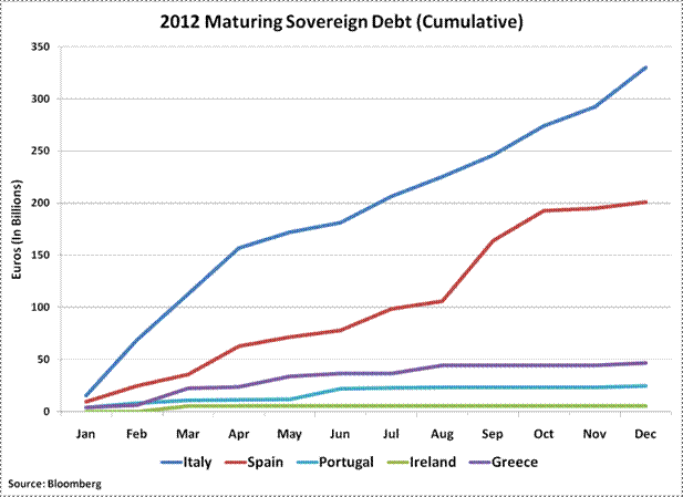
The chart below gives some sense of the relative importance of Italy – and to a slightly lesser degree Spain – in meeting its rollover demands this year versus the smaller euro area countries. The graph shows the cumulative amount of debt that will mature this year in the countries listed. (These totals count all government debt coming due – including shorter term notes – and are therefore larger than estimates of only long-term debt.) The graph shows the limited bond market needs (and therefore rescue funds needed) of Greece, Portugal, and Ireland, relative to those of Italy. Also, notice how steep the line is for Italy's maturing debt during the first four months of the year – when almost half of this year's total debt will mature.
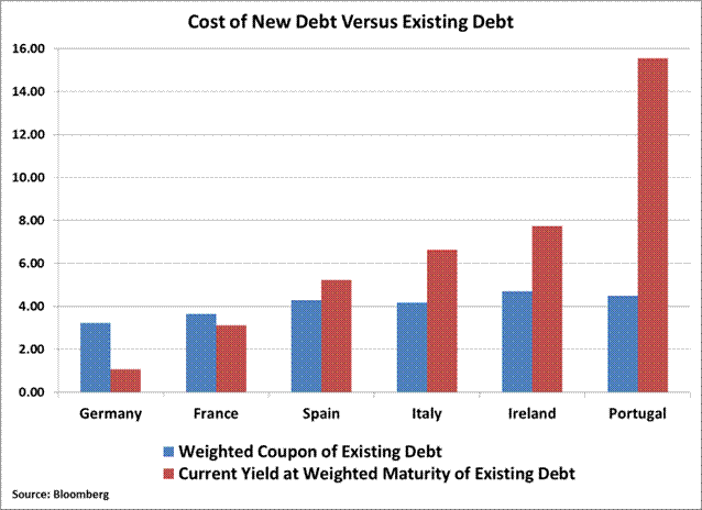
It will be important to watch bond auction demand in Italy and Spain in the beginning of the year. The recent bid to cover ratio – a measure of the eagerness of bond investor to participate in an auction – for Italy's 10-year notes has mostly been in line with results from early last year. Of course, the level of yield will also matter. The chart below shows the weighted coupon of the existing debt outstanding for each country (in blue) versus the current yield (using the weighted maturity of existing debt) of its bonds (in red). For many years during the Euro's first decade, borrowing costs continued to fall versus the average cost of the existing debt of these countries. This trend has now changed for most of Europe, except Germany and France. This will likely continue to further widen economic divergences among countries.
This is one more benefit Germany is deriving from the crisis. In addition to a weaker euro, which helps fuel its export-oriented economy, the cost of financing its sovereign debt relative to its existing debt continues to fall while the smaller countries struggle with rising financing costs.
3) The Depth of Italy's Recession
It would be difficult to overemphasize the importance of Italy retaining access to the bond markets, and mitigating further losses in its sovereign bonds. According to the Bank for International Settlements, foreign claims on Italian debt total $936 Billion – that's larger than the combined foreign claims on the debt of Portugal, Ireland, and Greece. And core Europe is long a mountain of Italian debt. French banks, for example, hold 45 percent of Italy's liabilities. Much more is at stake than France losing its Triple-A rating if Italy moves from a liquidity concern to a solvency concern.
What eventually would force that shift is if investors come to believe that the country's ability to handle its debt load over the long term is compromised. Those concerns can be partly alleviated if Italian Prime Minister Mario Monti delivers a balanced budget by 2013, which he promised this week. Unfortunately, near-term economic risks could make these goals difficult to meet in practice.
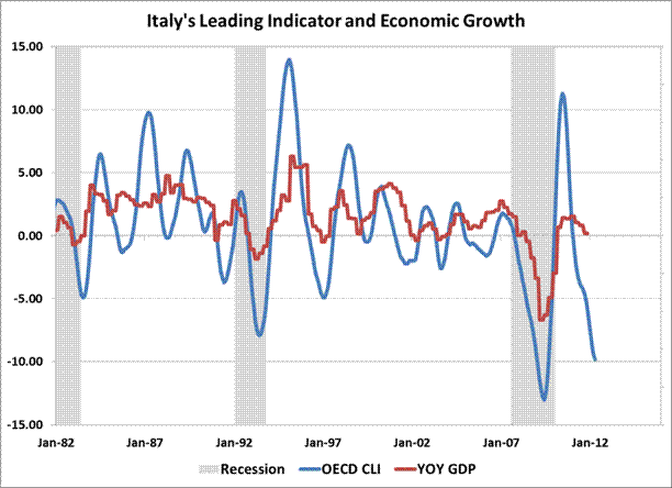
This year economists expect the Italian economy to contract only slightly – by 0.3%. The graph below shows the year-over-year change in the OECD composite leading indicator for Italy (lagged by six months) versus the year-over-year change in Italian GDP. The change in the leading indicator is currently -9.8 percent. That's suggesting a much deeper contraction in the Italian economy than current forecasts. Following any decline of greater than 5 percent in the year-over-year change of the leading indicator has led to an average contraction in the Italian economy of about 3 percent six months later.
Even assuming austerity measures might ease some of the country's debt load, it would be difficult to offset this steep of a decline in output. Hold debt levels static, and that rate of economic decline would force Italy's debt to GDP ratio to rise to 122% from 118% – clearly the wrong direction if the hope is to ease long-term solvency concerns.
Investors in Italian stocks may have moved some distance toward pricing in a deeper recession than what is currently expected by economists. The FTSE MIB Index declined 40 percent peak to trough last year (the index fell 25 percent on a calendar basis). But a deeper decline in Italy's economy this year that pushed debt to GDP ratios materially higher would likely catch bond investors' attention, and then ultimately the attention of global stock investors.
4) The ECB, LTROs and European Bank Funding
Will the ECB's three-year long-term refinancing operations (LTRO) work as a stealth quantitative easing program? Will banks borrow long-term funds from the ECB and turn around and buy sovereign debt? That's the hope. But there are strong tides of data pushing back against this idea.
While there was much fanfare last month after the ECB loaned 523 banks 489 billion euros, the actual amount of new funds was a more modest number. This is because two earlier loan programs expired on the same day as the three-year LTRO was held, and banks probably rolled these funds into the three-year operation. The earlier operations included a 3-month loan of 141 billion euros offered in September, and a net 112 billion euros of overnight loans. The ECB also allowed banks to shift 45 billion euros from an October operation into the 3-year LTRO. Of the 489 billion Euros operation, that left about 191 billion euros of fresh loans. (See this link for ECB euro operation results.)
Will this smaller figure be used by banks to buy sovereign debt? Any purchases will probably not in be in large amounts. That's because, as Bloomberg Economist David Powell recently pointed out, the 191 billion euros of new loans are less than the value of bank debt scheduled to come due this quarter alone. And with the unsecured debt markets essentially closed to many of these banks, the ECB loans will be needed to fund existing assets.
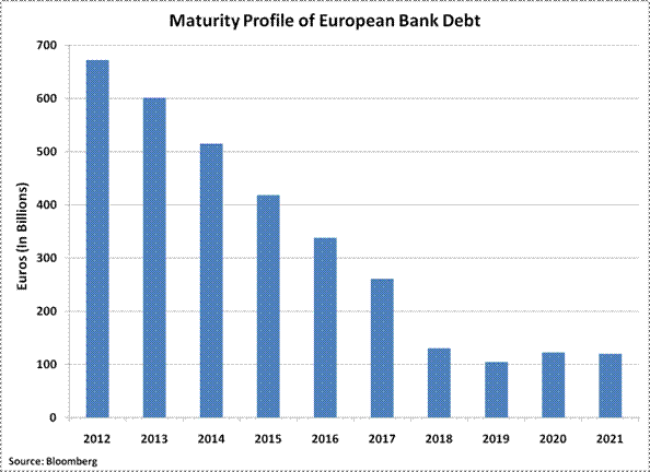
Up to 700 billion euros of European bank debt comes due this year, with about 200 billion euros coming due the first quarter, according to Bloomberg data. The financing needs coming due in the first quarter “imply that euro area banks will not have extra money as a result of the three-year auction to purchase European sovereign bonds, using a carry-trade strategy, because the amount of fresh cash is less than the amount of bank debt that will mature during the quarter”, Powell wrote recently.
Meanwhile, the ECB's balance sheet continues to grow. At 2.7 trillion euros, it's now levered 33 times to its own capital, versus a leverage ratio of 25 back in September. For investors holding out hope that the ECB becomes more involved in the debt crisis, it's clear that the central bank is already deeply involved.
As the size of the ECB's balance sheet grows, the quality of its collateral is declining. Open Europe, a Brussels-based think tank, estimates that through government bond purchases and liquidity provisions to banks, the ECB's exposure to Greece, Portugal, Ireland, Italy, and Spain has reached 705 billion euros, up from 444 billion euros in early summer - a 50 percent increase in six months (their note was published prior to the December 21 three-year LTRO, which likely further boosted lower quality collateral). They also remarked, “the number of banks which are becoming reliant on the ECB is alarming and hopes that the functioning of the European financial markets will ever return to normal are diminishing – creating a long-term threat to Europe's economy.”
5) Widespread Global Slowdown
Risks exist outside of Europe, too. Leading indicators suggest that the risks of a synchronized global downturn are building. (See John Hussman's recent discussion on this topic: When "Positive Surprises" Are Surprisingly Meaningless . ) The year-over-year changes in the OECD's Composite Leading Indexes for the United States, the United Kingdom, Japan, and Europe have all turned negative to varying degrees. Of these, the OECD's index that tracks Europe's major economies is declining at the fastest pace (-6.5), with the 12-month change in the US index falling just below zero in the latest release of the data.
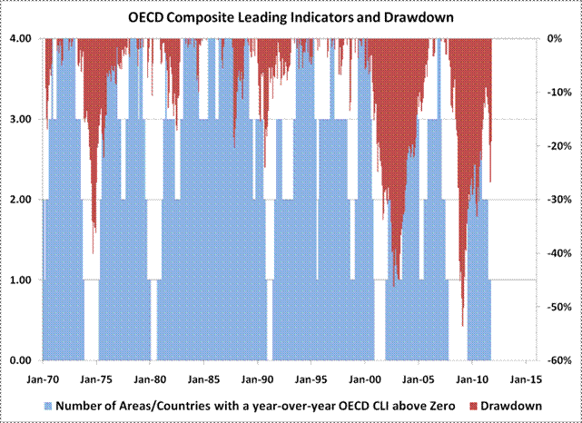
Now that negative leading indicator readings for these four major regions of the world are in place, stock market risks have climbed considerably. The graph below is one way to show the typical outcome when all of these leading indicators are negative. The red bars (right scale) represent drawdown – or the decline from each prior peak - in the MSCI World Index. The blue bars (left scale) are just a sum total of the number of regions where the year-over-year change in the OECD leading indicator is positive. The large blocks of blue areas reaching the top of the graph represent periods of widespread economic growth, such as the late-1980's and -1990's, when the leading indicators for all four regions were positive. The large blocks of white space represent those periods where economic contraction was widespread – such as in 1974, the early 1980's, in 2000, and in 2008. Importantly, the sum of positive leading indexes has dropped to zero once again.
Probably the best way to summarize this chart is that when the majority of developed economies have negative leading indicators on a year-over-year basis, investors should at least allow for large stock market declines. The declines beginning in 1974, 1990, 2000, and 2007 all began from periods when the leading indicators of all four regions had – or were about to - turn negative. The worst of those - 1974, 2000, and 2007 also began from very rich market valuations. The stock market collapse in 1987 is the only example of a large decline without at least some notification from the OECD's leading indicators of oncoming weakness. The 1980-1982 period, where global stocks fell more modestly, can be explained by the extremely low levels of valuation during that period, unlike today's higher levels.
The above global composite of OECD leading indicators also does a surprisingly good job of providing a coincident signal of US recession. Here are the dates where all four indicators first turned negative along with the actual month a US recession began in parenthesis: December 1973 (November 1973), February 1980 (January 1980), December 1990 (July 1990), December 2000 (March 2001), and November 2007 (December 2007). The indicator warned 5 months into the 1990 recession, and 3 months early in 2001, but within a month of each other recession (missing only the 1981 recession). This composite indicator turned negative with the October data.
Debt loads and economic growth vulnerability probably sum up this list of risks best. While these were topics investors focused on in 2011, this year will raise the stakes. Large quantities of debt will need to be rolled over and coincident indicators are likely to follow the currently downbeat leading ones. Both will need to be watched closely.

Tuesday, November 1, 2011

Hussman on Leading Vs. Lagging Economic Data

Read all of Dr. Hussman's weekly market commentaries here.

Accompanying the news of the "grand and comprehensive" European solution on Thursday was the news that GDP rose at an annual rate of 2.5% in the third quarter. There was already coincident data that the U.S. was not yet in contraction in August or September, so this was no surprise. Still, investors continued the habit of confusing lagging and coincident indicators for leading ones, so the positive GDP figure was taken as evidence that an oncoming economic downturn was "off the table."
I can't emphasize enough that leading evidence is in fact leading evidence. Take, for example, the ECRI Weekly Leading Index. It's certainly not a perfect indicator in itself, but its leading properties are instructive. If you look at the historical points where the WLI growth rate fell below zero, you'll find that weekly unemployment claims (a coincident indicator) were generally still about 3% below their 5-year average. It generally took about 13-16 weeks for unemployment claims to climb above that 5-year average, and even longer for the unemployment rate (a lagging indicator) to rise sharply. That's not much of a lag in the grand scheme of the full economic cycle, but allows a great deal of intervening and often contradictory action in the financial markets.
The tendency to demand predictable outcomes to also be immediate is a dangerous one, because it allows investors to be sucked in by temporary reprieves during what are, in fact, very negative conditions. As I noted in May (see Extreme Conditions and Typical Outcomes ), "It's clear that overvalued, overbought, overbullish, rising-yields syndromes as extreme as we observe today are even more important for their extended implications than they are for market prospects over say, 3-6 months. Though there is a tendency toward abrupt market plunges, the initial market losses in 1972 and 2007 were recovered over a period of several months before second signal emerged, followed by a major market decline. Despite the variability in short-term outcomes, and even the tendency for the market to advance by several percent after the syndrome emerges, the overall implications are clearly negative on the basis of average return/risk outcomes."
The same can be said here of economic prospects. Investors have almost entirely abandoned any concern about recession risk based on a few weeks of benign economic figures. Yet on the basis of indicators that have strong leading characteristics, a broad ensemble of evidence continues to suggest very high recession risks, and even sparse combinations of indicators provide a major basis for concern.
For example, since 1963, when the ECRI Weekly Leading Index growth rate has been below -5 and the ISM Purchasing Managers Index has been below 54, the economy has already been in recession 81% of the time, and the probability of recession within the next 13 weeks was 86%.
If in addition, the S&P 500 was below its level of 6 months earlier, the economy was already in recession 87% of the time, and the probability of recession within the next 13 weeks climbed to 93% (and then to 96% within 26 weeks). Under these conditions, once the PMI fell below 52, the probability of recession within 13 weeks climbed to 97%.

Friday, September 23, 2011

Leading Economic Indicators Remain Weak

from Econompic blog:
While leading economic indicators expanded 0.3% during August, the expansion remains focused on areas controlled by monetary policy rather than the underlying economy. For the third month in a row (and four of the past five), indicators outside the Fed's control were negative.

Thursday, May 19, 2011

Explanation from Goldman Sachs on Today's Dour Economic Data

I find it interesting that they blame Japan's woes for the Philly drop, but admit that they have no data to back it up.  This brings to five the plethora of bad economic news today. I'm amazed that the Dow isn't down 200 points!

Goldman Sachs on today's bad economic data:

1. The Philadelphia Fed's monthly manufacturing survey weakened sharply for the second month in a row. The headline index of "general business activity" fell to 3.9, from 18.5 in April and 43.4 in March. This still suggests factory sector growth, but only barely. Most of the detailed activity indexes also weakened - the new orders index fell to 5.4 from 18.8, the shipments index to 6.5 from 29.1, and the unfilled orders index to -7.8 from 12.9 - with the exception of employment, which rose to 22.1 from 12.3 in April. (We have no information on how much of the drop in the Philly survey over the past two months could have been related to supply chain issues associated with the Japanese earthquake, but this is not a region with an especially high concentration of vehicle manufacturing.) Price pressures eased a little but remain high in historical terms.

2. Existing home sales declined by 0.8% mom in April to an annualized rate of 5.05 million units. Consensus forecasts had expected a moderate increase. Home sales dropped in three of the four Census regions during the month, with the largest declines in the Northeast. The number of homes currently offered for sales was about unchanged after seasonal adjustment, at about 3.7 million units (the months supply of homes increased, but this was likely due to seasonal variation). The median sales price of existing homes increased by about 0.5% mom on a seasonally-adjusted basis-an encouraging turn after several months of weakness. Existing home sales prices are down 5% year-over-year.

3. Rounding out the weaker-than-expected data, the index of leading economic indicators fell by 0.3% mom in April. The consensus had expected a 0.1% inc

Sunday, September 19, 2010

John Hussman: Leading, Lagging, and Coincident Indicators

from HussmanFunds:

"Series that represent early stages of production and investment processes (new orders for durable goods, housing starts, or permits) lead series that represent late stages (finished output, investment expenditures). Under uncertainty, less binding decisions are taken first. For example, hours of work are lengthened (shortened) before the work force is altered by new hirings (layoffs)."

Victor Zarnowitz and Geoffrey Moore, "Sequential Signals of Recession and Recovery"
Journal of Business, 1982
Last week, we got a fresh set of economic indications from the Philadelphia Fed Survey. While the market evidently took relief from the modest uptick in the composite index to -0.7, a quick look at the component indices suggests a worsening of economic conditions in the latest report. Specifically, the Philly Fed new orders component fell to -8.1 from -7.1, which is the third month in negative territory. While there was a slight uptick in the index for number of employees (to 1.8 from -2.7), the better leading measure is the average employee workweek, where the index weakened to -21.6 from -17.1.
As I've emphasized in recent weeks, the U.S. economy is still in a normal "lag window" between deterioration in leading measures of economic activity and (probable) deterioration in coincident measures. Though the lags are sometimes variable, as we saw in 1974 and 2008, normal lags would suggest an abrupt softening in the September ISM report (due in the beginning of October), with new claims for unemployment softening beginning somewhere around mid-October. It's possible that the historically tight relationships that we've reviewed iin recent weeks will not hold in this particular instance, but we have no reasonable basis to expect that. Indeed, if we look at the drivers of economic growth outside of the now fading impact of government stimulus spending, we continue to observe little intrinsic activity.
The strongest forces driving economic expansion during a post-recession recovery phase is expansion in credit-sensitive expenditures such as housing, durable goods (such as autos) and gross investment, and in particular, inventory rebuilding. While capital expenditure for upgraded information technology is the clearest bright spot in recent GDP reports, it also represents a very small share of the economy. Other credit-sensitive classes of expenditure continue to face strong headwinds.
It is also important to understand that while consumption represents roughly 70% of economic activity, it is by far the least volatile component of GDP, particularly when durable goods are excluded. The main sources of fluctuation in GDP growth are credit-sensitive expenditures and inventories. Given the recent buildup of inventories and the expenditures on autos and home buying that were brought forward by programs such as cash-for-clunkers and the first-time homebuyers' credit, we are likely on the downside of those bursts of spending. For that reason, it appears likely that the positive growth of GDP in recent quarters will have relatively poor follow-through. A careful examination of sub-components of GDP growth leaves little reason to expect actual economic activity to deviate from what is already suggested by weak leading indicators.
If we observe both an improvement in those leading indicators and an improvement in market internals, our evaluation of investment conditions would be more constructive. For now, however, we remain defensive about risks that still appear significant.
On the housing front, last week's comments from Rick Sharga, the V.P. of RealtyTrac, are worth noting - "We're on track for a record year for homes in foreclosure and repossessions. There is no improvement in the underlying economic conditions. Whether things fall precipitously depends on government and lenders controlling the inflow of new foreclosure actions. If the market is left to fend for itself, you may see more serious price depreciation."
Lender Processing Services concurred, with its senior V.P. noting "Loans that have been delinquent for a historically long period of time are just now beginning to move through the pipeline. As of July 2010, the average length of time a loan in foreclosure had been delinquent was nearly 470 days. Now, after the intensive efforts of the last year or two, remaining home retention options appear to be exhausted and servicers are beginning to process more of these seriously delinquent loans."
My view remains that the underlying condition of the U.S. housing market is one of deep insolvency. The Treasury, Fed and the FASB have effectively made a policy out of opaque disclosure, so that at least the deterioration in the housing market is slow to appear on the balance sheets of major banks and financials. At present, the FASB allows "substantial discretion" in the valuation of mortgage-backed securities, which I suspect are being carried at a higher level than the value that the underlying cash flows (mortgage repayments) can actually support. Given that there is little pressure to disclose losses, and that mechanisms are in place (at least until the end of 2012) for the Treasury to bail out the entire flow of bad mortgages that funnel through Fannie Mae and Freddie Mac, it's not clear whether the growing mountain of delinquent and unforeclosed mortgages will provoke an abrupt crisis. My own expectation is that fresh economic pressure would provoke contagious pressure on the housing market to an extent that would be difficult to obscure.
That said, if the U.S. economy averts a period of fresh economic weakness, we could instead observe a more drawn out period of stagnation and price pressure. Ultimately the bad assets have to be placed on the market, which suggests further price pressure in the next few years. Weak labor conditions would also contribute further mortgage deterioration. Long-term, deficit-led inflation might be able to avert mortgage losses as home values gradually rise above the principal balances, eroding the real value of the debt, but this appears very unlikely in the immediate few years.
On the subject of inflation, I should emphasize that while I expect inflation pressures to be contained for several years, the impact of massive deficit spending should not be disregarded simply because Japan, with an enormously high savings rate, was able to pull off huge fiscal imbalances without an inflationary event. We may be following many of the same policies that led to stagnation in Japan, but one feature of Japan that we do not share is our savings rate. It is one thing to expand fiscal deficits in an economy with a very elevated private savings rate. In that event, the economy, though weak, has the ability to absorb the new issuance. It is another to expand fiscal deficits in an economy that does not save enough. Certainly, the past couple of years have seen a surge in the U.S. saving rate, which has absorbed new issuance of government liabilities without pressuring their value. But it is wrong to think that the ability to absorb these fiscal deficits is some sort of happy structural feature of the U.S. economy. It is not. It relies on a soaring savings rate, and without it, our heavy deficits will ultimately lead to inflationary events.
Hyperinflation is a much different story, and as I've said before, I am not in that camp. This doesn't exclude the possibility that enough policy mistakes will change that, but for now, my inflation outlook is flat for several years and then accelerating in the second half of this decade.
As Peter Bernholz notes in Monetary Regimes and Inflation (an economic study of inflation, including more than two dozen cases of hyperinflation), "The figures demonstrate clearly that deficits amounting to 40 per cent or more of expenditures cannot be maintained. They lead to high [inflation] and hyperinflations, reforms stabilizing the value of money, or in total currency substitution leading to the same results. The examples of both Germany and Bolivia suggest that at least deficits of about 30 per cent or more of gross domestic product are not maintainable since they imply hyperinflations... [In nearly all] cases of hyperinflation deficits amounting to more than 20 per cent of public expenditures are present."
At present, U.S. federal expenditures are about $5 trillion, versus about $4 trillion of revenues, and GDP of about $14.6 trillion. So the federal deficit is running at about 20% of expenditures, but less than 7% of GDP. This is not a profile that is consistent with hyperinflation, but it is also not a benign policy. Continued deficits will have substantial economic consequences once the savings rate fails to increase in an adequate amount to absorb the new issuance, and particularly if foreign central banks do not pick up the slack. We're not there for now, but it's important not to assume that the current period of stable and even deflationary price pressures is some sort of structural feature of the economy that will allow us to run deficits indefinitely.
Finally, given probable economic pressures and continued strong demand for default-free instruments, the likelihood of sustained upward pressure on bond yields remains limited here. At some point, probably years from now, we'll face a likely sustained increase in bond yields. We're often asked how that sort of environment would affect the Strategic Total Return Fund, given that we don't short bonds, and we don't buy "inverse floaters" or the like. A simple answer is that just as poor valuations and weak market returns have kept us from taking much exposure to stock market risk during the past decade, while the S&P 500 has gone nowhere, rising interest rates will limit the ability to profit from interest rate exposure. Water can't be squeezed from stones. Frankly, however, the returns of the Strategic Total Return Fund since its inception have not been dependent on a great deal of interest rate exposure in the first place. Even our present portfolio duration of 4 years is well below the average duration of the bond market.
So to a large degree, I expect we'll simply continue what we normally do, which is to vary our exposure in proportion to the expected return/risk profile of the various markets and security groups that we invest in. Markets rarely move in a straight line, and there is typically enough cyclical fluctuation within secular trends to present many opportunities to vary market exposure and portfolio duration. We have the ability to invest in a range of assets such as inflation protected securities, precious metals shares, and foreign currencies, as well as utility shares and other assets. An extended period of rising interest rates is likely to produce a bias toward shorter portfolio durations rather than longer ones. However, I don't expect that economic cycles would be eliminated, and to that extent, I don't expect that we'll be at a loss for opportunities to vary our investment exposures over the course of those cycles.
Market Climate
As of last week, the Market Climate for stocks remained characterized by unfavorable valuations, mixed market action, increasing bullish sentiment (approaching levels of overbullishness), and clear overbought conditions. As we've observed for months now, the stock market is still trading between widely followed support and resistance levels, with the S&P 500 bouncing off of the higher end of that channel last week. My primary concern is still the "recognition window" that I believe we have entered. The next several weeks will be important. As noted above, however, if leading measures of economic activity improve and internals improve, we'll be willing to accept a moderately more constructive position, but even here, our latitude to do so is somewhat restricted by valuations that are historically rich. As always, our intent is to align our position in proportion to the return/risk profile we expect. There's a moderate positive range that we'd be willing to operate within if we observe improvement in various economic measures, but for now, the evidence continues to warrant a strong defense. Both the Strategic Growth Fund and the Strategic International Equity Fund are tightly hedged.
In bonds, the Market Climate remained characterized by moderately unfavorable yield levels and favorable yield pressures. The Strategic Total Return Fund continues to carry a duration of about 4-years, and we are maintaining a range of 15-20% of assets allocated between precious metals shares, foreign currency exposure and modest holdings of utility shares.

Friday, September 3, 2010

David Rosenberg Points Out Something Fishy With Latest Economic Data

The latest batch of data has been highly confusing, to say the least. The chain store sales data were skewed by one-offs, such as retroactive jobless benefit checks that were mailed out in early August and the growing number (17 this year) of States offering sales tax holidays. We estimate that absent these influences, year-on-year sales growth would have been closer to 1% than 3%.
The spending data also belied the information contained in the Conference Board’s consumer confidence survey, as the facts-on-the ground ‘present situation’ index sagged to 24.9 in August from 26.4 in July — only 5% of the time in the past has it been so low. The ISM manufacturing index, which really got the ball rolling on this ‘take out the double-dip’ trade, managed to spike even though the three leading sub-indices — new orders, backlogs and vendor performance — all declined in what was a 1-in-100 event.
Not only that, but the employment component of the ISM surged to its highest level since December 1983, and yet the manufacturing employment segment of the payroll survey fell 27,000 — the first decline this year and the sharpest falloff since last October. Furthermore, the manufacturing diffusion index slumped to a seven-month low of 47 from 53 — in other words, fewer than half of the industrial sector was adding to staff requirements last month. It begs the question as to what exactly the ISM is measuring.
The list of inconsistencies in the data didn’t stop there. The entire increase in private sector employment in August was in the service sector — mostly health and education, which says little about the cyclical state of the economy. Yet 90 minutes after the jobs number was released, we got the ISM non-manufacturing survey and it flashed a contraction in services employment to a seven-month low of 48.2 from 50.9 in July.
Just a tad confusing, but the newly found bullish view of the economy is sort of corroborating evidence.
The employment report did not detract from the view that the economy is losing steam. The fourth quarter of a recovery typically sees real GDP growth of over 6% at an annual rate, but in this post-bubble credit collapse, what we got this time was 1.6% at an annual rate in Q2.
Moreover, there is nothing in the data to suggest anything but a further slowing in Q3, and the only reason why there is no contraction this quarter is because it looks as though we are getting another lift from inventories — though now the buildup looks involuntary, which will cast a cloud on fourth-quarter GDP barring a sudden reversal in the declining trend in real final sales.
Private payrolls were +247,000 when the equity market peaked in April, it slowed to +107,000 by July and was +67,000 last month. What does that suggest about the trend? Ditto for goods-producing employment, which was +67,000 in April, subsequently softened to +37,000 by July, and in August was the grand total of zero.
One can easily draw the conclusion from the data that we have dodged a bullet. But that does not mean we are out of the woods. Employment is a coincident indicator. Leading indicators, such as the ECRI, continue to deteriorate and to levels still consistent with nontrivial double-dip risks. Keep this in mind — private payrolls came in at +97,000 in November 2007 and the “Great Recession” began the next month. In other words, the +67,000 tally we saw today basically tells you nothing about how the pace of economic activity is going to unfold as we move into the fall.

Wednesday, July 7, 2010

Another Leading Indicator: Rock Concert Cancelations

from Rolling Stone:
The worst-selling summer concert season in recent memory has claimed another victim — Lilith Fair, which on Thursday canceled 10 shows, adding to a grim list that includes U2, Christina Aguilera, Limp Bizkit, Simon & Garfunkel, certain Eagles stadium dates and Rihanna's tour opener originally scheduled for tonight. "It's the reality of this summer," says Terry McBride, Lilith Fair's co-founder. "It's just across the board. Main Street is still in recession. We're not out of this yet. Did we see that four months ago? I don't think anyone did."

Monday, April 20, 2009

Leading Indicators Leading LOWER!

from Marketwatch:

The index of leading economic indicators fell 0.3% in March, following an upwardly revised dip of 0.2% in February. Building permits were the largest negative contributor in March, while the real money supply was the largest positive contributor. "There have been some intermittent signs of improvement in the economy in April, but the leading economic index and most of its components are still pointing down," said Ken Goldstein, economist at the Conference Board. Overall, six of the 10 indicators were negative contributors, three were positive, and one was steady.
It is not coincidental that the only indicators pointing higher are the ones the government manipulates -- like money supply!

Thursday, March 19, 2009

Leading Indicators Down .4%

The indicators that point to the direction of the U.S. economy 6-9 months down the road are pointing down for that time frame. This is particularly stunning given that some of these indicators are influenced by monetary expansion by the Fed, and these are inevitably pointing higher. The fact that the rest of the are pointing not only down, but much lower, is dragging the stock market down today.

Thursday, February 19, 2009

Perspective on Today's Positive LEI News

Marketwatch has the following article on why today's positive LEI was a head fake:

The LEI is a useful tool, but right now it's flashing a false sign of hope. The indicators that track the real economy are still falling, while most of the indicators that track the financial system are improving.
Despite what the indicators say, no one believes the financial system is actually improving in any meaningful way. Most of the improvement in the LEI in the past two months has been due to the massive expansion of the money supply engineered by the Federal Reserve. It's been rising at an 18% annual rate...
The LEI is an index of hope, not reality.

And I thought we had some good news today!

Some Good News -- Leading Indicators Looking Better

From Bloomberg:

The index of leading U.S. economic indicators rose more than expected in January, led by a jump in money supply that masked continued deterioration elsewhere in the economy.

The Conference Board’s gauge rose 0.4 percent, the most since December 2006, after a revised 0.2 percent increase this past December, the New York-based group said today. The index is designed to show the likely direction of the economy over the next three to six months.

Read the rest of the story here.