As we're all a bit forecast weary by this point in the year, here's a list - not of prognostications - but rather of potential risks that may come into even greater focus this year. These risks – whether they intensify or pass – will likely play an important role in driving the performance of global stock markets in 2012.
1) The Persistence of Wide Spreads Among European Debt – Even if Bond Holders are ‘Rescued'
There are two components of the European credit crisis - debt levels and economic growth prospects. While the conversations to this point have leaned mostly toward reducing debt levels, economic growth prospects and the overall viability of a common currency will likely get a closer look this year, especially as Europe heads for recession.
During this two-year crisis investors have continually called on the ECB and euro area leaders to ‘fix' the debt issue: by wiping out half of Greece's debt, by protecting Italy's access to debt markets through bond purchases, or by suggesting a levered EFSF, the euro area's rescue vehicle.
But even if the ECB does bend to the will of the bond markets this year, and begins to buy sovereign debt directly, the single currency is left with all of the same weaknesses that existed prior to the crisis: the inability to tailor interest rate policy for each individual economy, the lack of foreign currency adjustment needed to offset differences in competitiveness, and growth-limiting trade dynamics throughout the area.
Martin Feldstein, a long-time euro skeptic, in this month's Foreign Affairs magazine made the point this way: “During the past year, Germany had a trade surplus of nearly $200 billion, whereas the other members of the eurozone had trade deficits totaling $200 billion. A more comprehensive measure that factors in net investment income reveals that Germany has a current account surplus of nearly five percent of GDP, whereas Greece has a current account deficit of nearly ten percent of GDP. Put another way, Germany can invest in the rest of the world an amount equal to five percent of its GDP, whereas Greece must borrow an amount equal to nearly ten percent of its GDP to pay for its current level of imports”.
One of the strongest benefits at the introduction of the common currency was that investors priced government debt similarly across the euro area. During this period investors thought of the euro area as a group of countries that would not only share a currency, but also share economic performance and long-term outcomes. Smaller countries and those of southern Europe experienced the greatest amount of benefit from converging yields. Yield on Greek debt fell by more than half in less than 10 years. Even stock market valuation ratios converged. The spread between the countries with the highest and lowest PE ratios dropped by more than half during the period.
While this period could have been used to improve some of the issues surrounding productivity, competitiveness, and trade dynamics among countries, what occurred instead was that governments took on larger amounts of liabilities, and as interest rates fell, housing bubbles formed. With that period passed, it's difficult to imagine that investors will soon return to the mindset that Portugal, Ireland, or even Italy, will soon again converge materially – in either economic performance or level of credit risk - with Germany.
I highlighted this risk and the graph below early in the European credit crisis ( The Great Divergence ). At that point the sovereign debt of Portugal was priced at 200 basis points above German bunds, compared with 1100 basis points today. Here is an updated graph.
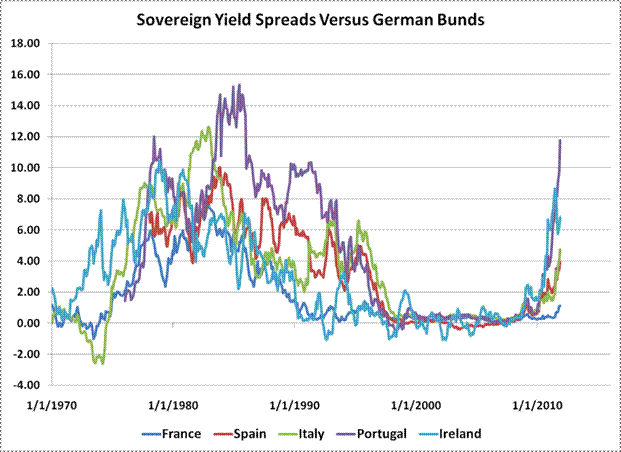
There is a long history prior to the period of the shared currency where spreads among countries and with Germany were dramatically and persistently wider than even today. This was because expected economic growth rates, inflation expectations, and the real rates required by investors differed. Now that investors have been reminded of the structural weaknesses of a common currency – even outside of the discussion of high debt loads - persistently high spreads may be here to stay. Those spreads will surely play a role in the potential long-term growth rates of economies and euro area stock market valuations.
2) Sovereign Debt Rollover Risks
When the history of the European Credit Crisis is written, it'll likely be in two parts. The first part will cover the debt crisis of the smaller European countries – mainly the woes of Greece, Portugal, and Ireland. It will cover Greece's admission that its accounting didn't add up. And how Ireland's bad bank debt was turned into sovereign debt – which tripled its debt to GDP ratio in just three years. It will also cover the trajectory of peripheral sovereign bond yields in the face of investor uncertainty, where yields were first pushed above seven percent, and then eventually to much higher levels, forcing a rescue program.
The second part of the story will be about Italy and Spain, and potentially France, and how they were either pulled into the fiscal debt maelstrom or whether the ECB and euro area leaders were able to ring-fence them from the more troubled smaller euro countries. It will cover whether investors pushed these core countries from liquidity concerns to solvency concerns. While these chapters are still being written, the outcome may very well be available to historians (and investors) much sooner than many are expecting. One reason is because of the vast amount of sovereign and bank debt that is due to mature this year, all of which will needed to be rolled over because of existing budget deficits. The two countries that pose the greatest risks for rolling over this debt are Italy and Spain.
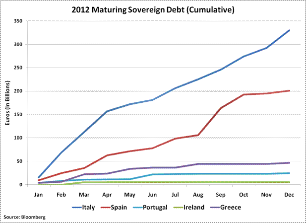
The chart below gives some sense of the relative importance of Italy – and to a slightly lesser degree Spain – in meeting its rollover demands this year versus the smaller euro area countries. The graph shows the cumulative amount of debt that will mature this year in the countries listed. (These totals count all government debt coming due – including shorter term notes – and are therefore larger than estimates of only long-term debt.) The graph shows the limited bond market needs (and therefore rescue funds needed) of Greece, Portugal, and Ireland, relative to those of Italy. Also, notice how steep the line is for Italy's maturing debt during the first four months of the year – when almost half of this year's total debt will mature.
It will be important to watch bond auction demand in Italy and Spain in the beginning of the year. The recent bid to cover ratio – a measure of the eagerness of bond investor to participate in an auction – for Italy's 10-year notes has mostly been in line with results from early last year. Of course, the level of yield will also matter. The chart below shows the weighted coupon of the existing debt outstanding for each country (in blue) versus the current yield (using the weighted maturity of existing debt) of its bonds (in red). For many years during the Euro's first decade, borrowing costs continued to fall versus the average cost of the existing debt of these countries. This trend has now changed for most of Europe, except Germany and France. This will likely continue to further widen economic divergences among countries.
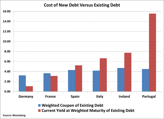
This is one more benefit Germany is deriving from the crisis. In addition to a weaker euro, which helps fuel its export-oriented economy, the cost of financing its sovereign debt relative to its existing debt continues to fall while the smaller countries struggle with rising financing costs.
3) The Depth of Italy's Recession
It would be difficult to overemphasize the importance of Italy retaining access to the bond markets, and mitigating further losses in its sovereign bonds. According to the Bank for International Settlements, foreign claims on Italian debt total $936 Billion – that's larger than the combined foreign claims on the debt of Portugal, Ireland, and Greece. And core Europe is long a mountain of Italian debt. French banks, for example, hold 45 percent of Italy's liabilities. Much more is at stake than France losing its Triple-A rating if Italy moves from a liquidity concern to a solvency concern.
What eventually would force that shift is if investors come to believe that the country's ability to handle its debt load over the long term is compromised. Those concerns can be partly alleviated if Italian Prime Minister Mario Monti delivers a balanced budget by 2013, which he promised this week. Unfortunately, near-term economic risks could make these goals difficult to meet in practice.
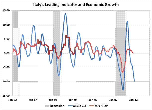
This year economists expect the Italian economy to contract only slightly – by 0.3%. The graph below shows the year-over-year change in the OECD composite leading indicator for Italy (lagged by six months) versus the year-over-year change in Italian GDP. The change in the leading indicator is currently -9.8 percent. That's suggesting a much deeper contraction in the Italian economy than current forecasts. Following any decline of greater than 5 percent in the year-over-year change of the leading indicator has led to an average contraction in the Italian economy of about 3 percent six months later.
Even assuming austerity measures might ease some of the country's debt load, it would be difficult to offset this steep of a decline in output. Hold debt levels static, and that rate of economic decline would force Italy's debt to GDP ratio to rise to 122% from 118% – clearly the wrong direction if the hope is to ease long-term solvency concerns.
Investors in Italian stocks may have moved some distance toward pricing in a deeper recession than what is currently expected by economists. The FTSE MIB Index declined 40 percent peak to trough last year (the index fell 25 percent on a calendar basis). But a deeper decline in Italy's economy this year that pushed debt to GDP ratios materially higher would likely catch bond investors' attention, and then ultimately the attention of global stock investors.
4) The ECB, LTROs and European Bank Funding
Will the ECB's three-year long-term refinancing operations (LTRO) work as a stealth quantitative easing program? Will banks borrow long-term funds from the ECB and turn around and buy sovereign debt? That's the hope. But there are strong tides of data pushing back against this idea.
While there was much fanfare last month after the ECB loaned 523 banks 489 billion euros, the actual amount of new funds was a more modest number. This is because two earlier loan programs expired on the same day as the three-year LTRO was held, and banks probably rolled these funds into the three-year operation. The earlier operations included a 3-month loan of 141 billion euros offered in September, and a net 112 billion euros of overnight loans. The ECB also allowed banks to shift 45 billion euros from an October operation into the 3-year LTRO. Of the 489 billion Euros operation, that left about 191 billion euros of fresh loans. (See this link for ECB euro operation results.)
Will this smaller figure be used by banks to buy sovereign debt? Any purchases will probably not in be in large amounts. That's because, as Bloomberg Economist David Powell recently pointed out, the 191 billion euros of new loans are less than the value of bank debt scheduled to come due this quarter alone. And with the unsecured debt markets essentially closed to many of these banks, the ECB loans will be needed to fund existing assets.
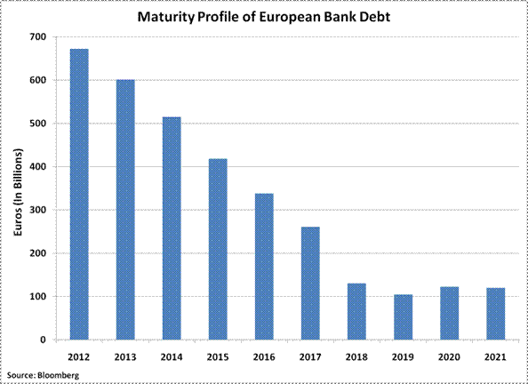
Up to 700 billion euros of European bank debt comes due this year, with about 200 billion euros coming due the first quarter, according to Bloomberg data. The financing needs coming due in the first quarter “imply that euro area banks will not have extra money as a result of the three-year auction to purchase European sovereign bonds, using a carry-trade strategy, because the amount of fresh cash is less than the amount of bank debt that will mature during the quarter”, Powell wrote recently.
Meanwhile, the ECB's balance sheet continues to grow. At 2.7 trillion euros, it's now levered 33 times to its own capital, versus a leverage ratio of 25 back in September. For investors holding out hope that the ECB becomes more involved in the debt crisis, it's clear that the central bank is already deeply involved.
As the size of the ECB's balance sheet grows, the quality of its collateral is declining. Open Europe, a Brussels-based think tank, estimates that through government bond purchases and liquidity provisions to banks, the ECB's exposure to Greece, Portugal, Ireland, Italy, and Spain has reached 705 billion euros, up from 444 billion euros in early summer - a 50 percent increase in six months (their note was published prior to the December 21 three-year LTRO, which likely further boosted lower quality collateral). They also remarked, “the number of banks which are becoming reliant on the ECB is alarming and hopes that the functioning of the European financial markets will ever return to normal are diminishing – creating a long-term threat to Europe's economy.”
5) Widespread Global Slowdown
Risks exist outside of Europe, too. Leading indicators suggest that the risks of a synchronized global downturn are building. (See John Hussman's recent discussion on this topic: When "Positive Surprises" Are Surprisingly Meaningless . ) The year-over-year changes in the OECD's Composite Leading Indexes for the United States, the United Kingdom, Japan, and Europe have all turned negative to varying degrees. Of these, the OECD's index that tracks Europe's major economies is declining at the fastest pace (-6.5), with the 12-month change in the US index falling just below zero in the latest release of the data.
Now that negative leading indicator readings for these four major regions of the world are in place, stock market risks have climbed considerably. The graph below is one way to show the typical outcome when all of these leading indicators are negative. The red bars (right scale) represent drawdown – or the decline from each prior peak - in the MSCI World Index. The blue bars (left scale) are just a sum total of the number of regions where the year-over-year change in the OECD leading indicator is positive. The large blocks of blue areas reaching the top of the graph represent periods of widespread economic growth, such as the late-1980's and -1990's, when the leading indicators for all four regions were positive. The large blocks of white space represent those periods where economic contraction was widespread – such as in 1974, the early 1980's, in 2000, and in 2008. Importantly, the sum of positive leading indexes has dropped to zero once again.
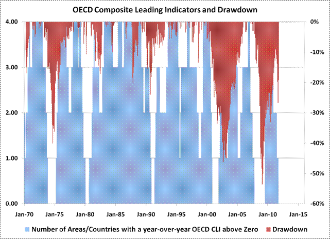
Probably the best way to summarize this chart is that when the majority of developed economies have negative leading indicators on a year-over-year basis, investors should at least allow for large stock market declines. The declines beginning in 1974, 1990, 2000, and 2007 all began from periods when the leading indicators of all four regions had – or were about to - turn negative. The worst of those - 1974, 2000, and 2007 also began from very rich market valuations. The stock market collapse in 1987 is the only example of a large decline without at least some notification from the OECD's leading indicators of oncoming weakness. The 1980-1982 period, where global stocks fell more modestly, can be explained by the extremely low levels of valuation during that period, unlike today's higher levels.
The above global composite of OECD leading indicators also does a surprisingly good job of providing a coincident signal of US recession. Here are the dates where all four indicators first turned negative along with the actual month a US recession began in parenthesis: December 1973 (November 1973), February 1980 (January 1980), December 1990 (July 1990), December 2000 (March 2001), and November 2007 (December 2007). The indicator warned 5 months into the 1990 recession, and 3 months early in 2001, but within a month of each other recession (missing only the 1981 recession). This composite indicator turned negative with the October data.
Debt loads and economic growth vulnerability probably sum up this list of risks best. While these were topics investors focused on in 2011, this year will raise the stakes. Large quantities of debt will need to be rolled over and coincident indicators are likely to follow the currently downbeat leading ones. Both will need to be watched closely.